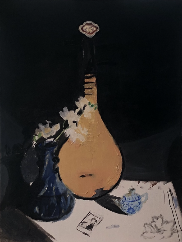
Amy, Your painting is looking good. Keep focusing on the use of cool and warm dark and light colors. Can the background go from blue black to yellow/green black? Can the white table cloth be a yellow gray and a blue gray? If you see a soft edge then the values should be similar (light gray to medium light gray). If you see a hard edge, then the values are high contrast and have a difference in value (white to black). Can you put a copy of the photo in the same gallery as your painting progress so we can compare images?
Thank you.
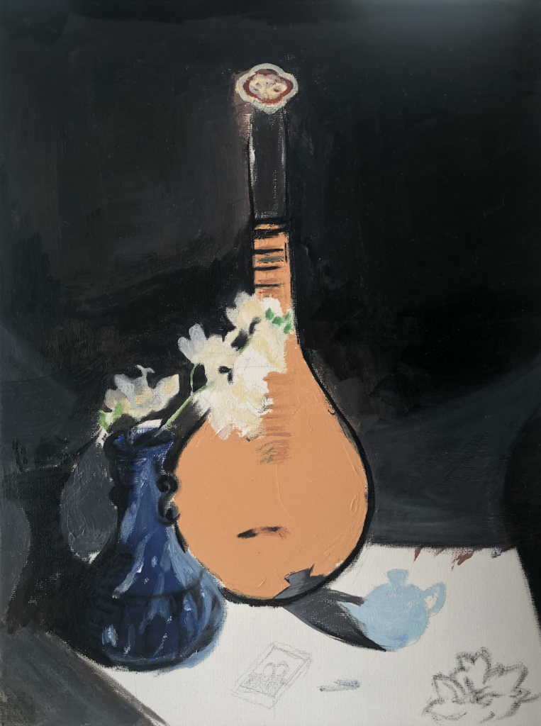
Your progress is beautiful Amy! I agree with Deirdre and am looking forward to how you develop perspective using various tonal blacks, as well as the left side of the painting. The shadows on the table and wall from the blue pot are one of my favorite parts of your photograph and I’m excited to see it come to life!
4 Comments
Amy, Your painting is looking good. Keep focusing on the use of cool and warm dark and light colors. Can the background go from blue black to yellow/green black? Can the white table cloth be a yellow gray and a blue gray? If you see a soft edge then the values should be similar (light gray to medium light gray). If you see a hard edge, then the values are high contrast and have a difference in value (white to black). Can you put a copy of the photo in the same gallery as your painting progress so we can compare images?
Thank you.
I love the dainty little tea pot on the right hand side.
Your progress is beautiful Amy! I agree with Deirdre and am looking forward to how you develop perspective using various tonal blacks, as well as the left side of the painting. The shadows on the table and wall from the blue pot are one of my favorite parts of your photograph and I’m excited to see it come to life!
Your chromatic grey background is amazing. It helps the blue vase look realistic and beautiful. I’m excited to see your white flower.